Here's what happens when vision meets execution. These aren't just pretty renderings - they're actual buildings where real people live, work, and thrive. We've documented the journey from first sketch to final walkthrough, including the messy bits that nobody usually talks about.
When the Johnsons came to us, they had a classic Vancouver 1960s rancher that was bleeding energy costs. Loved the neighborhood, hated their hydro bills. They wanted something modern but weren't trying to be that house on the block, y'know? Plus, they had a strict budget after already overpaying for the lot.
Before: Energy vampire circa 1962
After: Net-zero energy performance
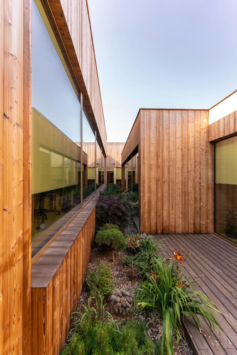
Instead of the typical teardown-rebuild route, we kept the foundation and main structure. Stripped everything else though. Added a second story that's basically invisible from the street - neighborhood character preserved, square footage doubled. The real magic happened with the building envelope.
First year's been wild. They actually sell power back to BC Hydro most months. Winter was the real test - we had that cold snap in January and their heating bill was... nothing. System handled it perfectly. Mrs. Johnson jokes that her friends think she's lying about the energy costs.
Construction came in 8% under budget because we didn't have to deal with foundation work. That savings went straight into better appliances and finishes. Win-win.
Heritage building from 1889, been everything from a warehouse to a failed restaurant space. New owners wanted to turn it into premium office space for tech companies without destroying what made it special. Also had to deal with the heritage committee, which... let's just say it was a learning experience for everyone involved.
Original state: Beautiful bones, everything else was shot
Now: Three tech companies call it home
We basically had to build a modern building inside a heritage shell. Kept all the original brick, those massive timber beams (after serious reinforcement), and the cast iron columns. Everything else? Fair game. Took eighteen months of meetings with the heritage folks to get approvals, but we got there.
Building's been occupied for two years now. Tenants actually like coming to the office, which apparently is rare these days. The exposed brick and timber beams photograph well, so it's been good for their recruiting. Energy performance exceeded our models by 12%, probably because the thermal mass from all that old brick is doing more work than we calculated.
Won a heritage preservation award last year, which was cool. But honestly, the best part is just seeing the building full of people again instead of sitting empty.
Developer wanted to maximize units on a corner lot but the neighborhood was pushing back hard on density. Fair enough - nobody wants a concrete tower next to their house. We proposed something different: a six-unit building that looks more like a big house than an apartment block. Took some convincing.
Started with: One lot, lots of opinions
Ended up with: Six homes, happy neighbors
We broke up the mass so it reads as three connected buildings instead of one big box. Each unit gets its own entrance at grade - no shared hallways, no elevator. Basically townhouses that share walls and a common green roof. Used fiber cement panels that look like wood but won't need replacing in fifteen years.
Went pretty aggressive here because the developer was actually into it. Full solar array on the south-facing roof sections generates about 40% of the building's annual electricity needs. Rainwater system handles all the landscaping irrigation and the green roof actually works - we've got photos of bees and everything.
Construction waste diversion hit 89%, which is way better than the 65% target. Turns out when you design with standard dimensions and actually coordinate with the trades, you don't waste as much material. Who knew?
68% better than baseline building code requirements
45% reduction in potable water use vs. standard
Units sold out in pre-sale, which helped the developer feel better about trusting our design. Owners moved in about eight months ago. A couple of them have reached out to say their heating costs are way lower than their old places. One guy measured his indoor air quality with some fancy gadget and sent us the data - it's really good, apparently.
Best moment was when a neighbor who opposed the project at the public hearing stopped by to say it actually looks nice and they're glad we didn't build what the previous developer wanted. That's pretty much the dream right there.
Chef wanted to open his first solo spot in a space that had been a rotating door of failed restaurants. Location was great but the layout was terrible - kitchen visible from everywhere, weird columns in random spots, acoustics that made conversation impossible when busy. Previous tenant literally abandoned their equipment and just walked away.
What we started with - promising bones, questionable everything else
Completely flipped the layout. Kitchen went to the back where it should've been from day one. Built a proper prep area that doesn't feel like working in a closet. Used those annoying columns as natural dividers between sections - turned a bug into a feature.
Big move was dropping the ceiling in strategic spots to create acoustic zones. Open kitchen stays open, but we added a glass partition with a shelf that doubles as a pass area. Chef can see the dining room, diners can watch the action, but the noise and heat stay mostly contained.
Budget was tight so we got creative. Scored reclaimed wood from a demolished warehouse in New West - became the main feature wall and bar front. Local fabricator made custom light fixtures from recycled copper pipe. Tables are FSC maple from BC mills.
Flooring was the splurge - polished concrete with radiant heating underneath. Looks clean, super durable, and helps with the heating bills. Plus you can't destroy it, which matters in a restaurant.
Reclaimed wood feature wall
New kitchen configuration
Custom copper light fixtures
Restaurant opened six months ago and they're doing well - booked most nights, good reviews, chef's not pulling his hair out about the space. Staff actually like working there, which is apparently unusual in the industry.
We spec'd all LED lighting and high-efficiency kitchen equipment. Their utility costs are running about 30% lower than the previous tenant's bills, and they're doing more covers. Sometimes efficiency actually saves money - imagine that.
Chef texted me last month to say the space "just works" and he doesn't think about the layout anymore. That's basically the highest compliment you can get in restaurant design. If they're not cursing your name during dinner service, you did okay.
Featured in Vancouver Magazine's "Best New Restaurant Spaces" and shortlisted for an IIDA design award. More importantly, it's still in business, which is what actually matters.
Currently on-site and in the pipeline